Every wave of computing has been defined as much by its interface as by its underlying technology. The command line made computers usable by experts, the graphical interface made them usable by everyone, and the touchscreen put them in every pocket. Agentic AI is now forcing the next interface question, and it is a harder one than it first appears: what should software look like when it does not just respond to commands but acts on your behalf, over time, with a degree of independence? The models have raced ahead of the interfaces we have for them, and the gap shows. This post is about closing that gap — about agent UX, the design discipline of building interfaces for software that acts.
The interface is the product
It is tempting to believe that in an agentic product the model is the product, and the interface is a thin wrapper to be tidied up later. Experience with real users suggests almost the opposite. Two products built on the same model, with the same tools and the same prompts, can produce wildly different outcomes depending on how they present the agent’s work, how they ask for input, and how they handle the moments when the agent is unsure or wrong. The interface is where the user decides whether to trust the system, and trust is the resource that determines how much autonomy they will grant it. An agent the user does not trust gets asked to do trivial things, supervised constantly, and eventually abandoned; the same agent behind an interface that earns trust gets delegated real work.
This is worth stating plainly because agent UX is chronically underinvested. Teams spend months on model selection, tool design, and evaluation, then bolt a chat window onto the front and call it done. But a user’s experience of an agent is composed almost entirely of interface decisions: what they see while the agent works, how they discover what it can do, how they correct it when it goes wrong, and how they come to believe — or not — that it will handle the next task without supervision. Those are design problems, and they are hard ones, because the interface patterns of the last forty years were built for software that waits for instructions and does exactly what it is told. Agents break both assumptions.
Chat was the demo, not the destination
Chat deserves credit: it is the interface that made large language models legible to the world. A text box that answers back is instantly understandable, infinitely flexible, and requires no manual. For conversation — questions, drafting, brainstorming — it remains hard to beat. But as the thing on the other side of the text box has evolved from a conversationalist into a worker, the seams have begun to show.
Chat collapses everything into a single linear transcript. When an agent works for twenty minutes across a dozen tools, the transcript becomes a scrolling wall in which the important moments — the decision that needs your input, the result that needs your review — are buried between tool logs and progress chatter. Chat has no natural place for state: what is the agent doing right now, what has it finished, what is blocked, what does it intend to do next? Users are forced to scroll and reconstruct, which is exactly the kind of bookkeeping software is supposed to do for them. And chat frames every interaction as a conversation, which subtly miscalibrates expectations: you chat with a peer, but you delegate to a worker, and delegation needs briefs, status reports, and deliverables rather than repartee.
None of this means chat disappears. It means chat becomes one surface among several — the place where you brief the agent and negotiate ambiguity, not the place where all of the work lives. The products pulling ahead pair a conversational channel with dedicated surfaces for plans, progress, and results, and the rest of this post is largely a tour of those surfaces.
The autonomy spectrum, made visible
Underneath every agent interface is a dial that runs from tool to teammate. At one end, the human drives and the AI assists keystroke by keystroke: autocomplete, inline suggestions, single-shot edits. At the other end, the agent runs unattended for hours and delivers finished work. Most products live somewhere in between, and the central job of agent UX is to make the current position on that dial visible, adjustable, and honest.
Visible, because the user should never have to wonder whether the system is about to act or merely suggest. The interface state that precedes an action — a highlighted diff, a staged email, a pending plan — must be unmistakably different from the state that follows one. Adjustable, because the right level of autonomy depends on the task, the stakes, and the user’s accumulated trust; a good interface lets the user grant more rope for low-stakes work and pull it back for consequential work without editing a config file. Honest, because nothing destroys trust faster than an interface that implies more caution than the system actually exercises. If the agent will send the email without a final look, the interface must not suggest otherwise.
The job of an agent interface is to make autonomy visible, adjustable, and honest — the user should always know what the system will do on its own and what it will ask about first.

Show the work: progress as a first-class surface
The defining experience of using an agent is waiting for it, and waiting is a design material. A long silence is indistinguishable from a hang; a stream of raw tool logs is noise that teaches the user to stop reading. Between those extremes sits the surface that good agent products get right: a legible, real-time account of what the agent is doing, at the level of intent rather than mechanics.
The difference is between “calling search_flights with params...” and “comparing Tuesday fares across three airlines.” The former is a debug log; the latter is a status report. Users do not need to see every tool call, but they need to be able to answer, at a glance, three questions: what is it doing now, what has it done so far, and how much is left? A simple, current activity line plus a collapsible history of completed steps answers all three. The collapse matters — the detail should be available on demand for the skeptical or the curious, and out of the way for everyone else.
Showing the work does more than soothe impatience. It builds calibrated trust, because the user can see the agent’s reasoning path and catch it going astray early — a wrong assumption surfaced in minute one costs a correction; the same assumption discovered in the final result costs the whole run. It also creates the natural intervention points that the next sections depend on: you cannot steer what you cannot see.
Plans are artifacts, not chatter
Before an agent embarks on anything nontrivial, it forms an intention: the steps it will take, the resources it will touch, the things it is unsure about. Most interfaces either hide this entirely or dissolve it into conversational prose. The stronger pattern is to treat the plan as an artifact — a structured, editable object that the user can review, modify, and approve before execution begins.
A plan artifact changes the interaction in three ways. It converts vague anxiety into specific review: instead of wondering what the agent might do, the user reads what it will do. It creates a cheap correction point: editing step three of a plan costs seconds, while correcting the consequences of a wrong step three after execution can cost the whole session. And it establishes a contract that makes the results reviewable — when the work comes back, it can be organized against the plan the user approved, so review becomes checking deliverables rather than archaeology.
Plans need not be heavyweight. For a small task the plan might be one sentence with an implicit “proceed?”; for a large one it might be a checklist with per-step approvals. The principle scales: intent should be visible before action, in a form the user can grab and reshape.
Approvals that respect attention
Every agent product eventually needs to ask the user for permission, and how it asks is one of the highest-leverage design decisions in the entire system. Ask too rarely and the agent does frightening things unsupervised. Ask too often and you manufacture the most corrosive failure mode in safety design: approval fatigue, the state in which the user clicks yes reflexively because saying yes has always been fine before. A user who rubber-stamps is worse than a user who is never asked, because the interface has spent their attention and bought no safety with it.
The remedy is to spend attention like the scarce currency it is. A few rules follow from that framing:
Scale ceremony to consequence. Reversible, low-stakes actions should proceed silently or with a passive notice; irreversible or expensive ones deserve a real interruption. When everything is a modal, nothing is.
Make the question answerable. An approval prompt must carry enough context to be judged on its face — what will happen, to what, and why — without the user reconstructing the session. “Send this email to the client?” with the draft in view is answerable; “Proceed?” is not.
Batch related decisions. Seven consecutive prompts about seven files is a design failure; one prompt with a reviewable list of seven items is the same safety at a seventh of the cost.
Let approval teach the system. “Yes, and don’t ask again for this kind of thing” is how a user hands over autonomy at their own pace, one category at a time.
Underneath all four rules is a single idea: the approval prompt is not a liability shield, it is a communication channel. Its purpose is to transfer a genuine decision to the human at the moment the human’s judgment adds value, and at no other moment.
Steering without stopping
Traditional software offers two controls over a running process: let it finish or kill it. Agents invite a third, more interesting verb: steer. Because an agent works in observable steps and holds a revisable intention, the user should be able to lean in mid-run — correct a wrong assumption, narrow a scope, add a constraint — without discarding the work already done.
Interfaces handle this badly by default. If the user’s only input channel is the same chat box that started the task, a mid-run message is ambiguous: is it a new task, a correction, or a cancellation? Good agent UX makes interjection a designed act with clear semantics — a way to annotate the running plan, flag a step, or drop a note the agent will incorporate at the next natural boundary. Equally important is the guarantee that interjecting is safe: a user who fears their correction will restart twenty minutes of work will sit on their hands and let the agent finish wrong. The economics of steering must always beat the economics of waiting and redoing.

Reversibility is an interface feature
The single most trust-generating property an agent product can have is a working undo. Every approval prompt is really the question “are you sure?” — and the entire weight of that question comes from irreversibility. Make an action undoable and the question shrinks to almost nothing; the user can allow the agent to proceed freely, knowing mistakes are recoverable rather than catastrophic.
This is usually discussed as backend architecture — checkpoints, soft deletes, staged writes — but it is just as much an interface obligation. The user needs to see what can be undone, how far back the safety net extends, and where the points of no return actually are. A session timeline with restorable checkpoints turns an abstract promise into a visible ledger. And where genuine irreversibility exists — a sent email, an executed payment — the interface should make that boundary visually unmistakable, so the user’s caution lands exactly where it is needed and nowhere else. An interface that marks everything as dangerous teaches users nothing is; an interface that marks the truly dangerous marks it credibly.
Calibrating trust, not maximizing it
It is easy to assume the goal of agent UX is to make users trust the agent more. The real goal is calibration: the user’s trust should match the system’s actual reliability, task by task. Overtrust produces unreviewed mistakes shipped to clients; undertrust produces a supervision burden that erases the value of automation. Both are interface failures as much as model failures.
Calibration is built from small, honest signals. When the agent is uncertain, the interface should carry that uncertainty forward — flagging the step it guessed on, the source it could not verify, the assumption it had to make — rather than laundering everything into uniform confident prose. When the agent is reliably good at a category of task, the interface can say so, with evidence: this kind of task has succeeded the last forty times, so consider letting it run without review. Confidence theater in either direction is poison. A hedge on every sentence teaches users to ignore hedges; unbroken confidence teaches users to stop checking exactly when they should not.
The goal is not more trust — it is accurate trust. The interface should help the user learn, as fast as possible, what the agent is reliably good at and where it still needs a second pair of eyes.
The background agent and the notification problem
As agents graduate from supervised sessions to standing, scheduled, and triggered work, the interface problem inverts. In a session, the user is present and the question is what to show them. In the background, the user is absent and the question becomes when to interrupt them — and every notification is a withdrawal from the same attention budget that approvals spend.
The failure modes are familiar from a decade of notification-happy apps, but agents raise the stakes because what they have to report is often consequential. The design discipline is triage. Outcomes that matter get surfaced through a channel matched to their urgency: a blocked task that needs a decision now interrupts; a completed routine task lands in a digest; an anomaly worth knowing about but not acting on waits for the next natural check-in. The worst pattern is the undifferentiated stream in which “your weekly report is ready” and “I could not reconcile the invoices and payroll is tomorrow” arrive with identical weight.
Background agents also need a home — a place the user can visit to see every standing task, its last run, its next run, and its recent results. The moment a user cannot enumerate what is running on their behalf, autonomy has turned from a feature into a source of unease. A simple registry of active agents, boring as it sounds, is one of the most confidence-producing screens a product can ship.
Results deserve better than a wall of text
When the run completes, the agent has one more job: hand over the work in a form the human can verify quickly. This is the moment the entire product has been building toward, and it is routinely fumbled by dumping ten paragraphs of summary prose into the transcript.
The strong pattern is the deliverable, not the essay. Work product should arrive as an artifact appropriate to its type — a document, a table, a diff, a draft sitting in the outbox — separated from the narrative about how it was made. The narrative still matters, but as a cover note: what was done, what choices were made, what the agent was unsure about, what it recommends reviewing. Where the work changed something, show the change in before-and-after form rather than describing it; a diff communicates in seconds what prose cannot in paragraphs. And the report should lead with what needs human judgment — flagged uncertainties, skipped steps, decisions made on assumptions — because the reviewer’s scarce resource is, again, attention, and the interface’s job is to aim it.
Designing the failure states
Agent work fails differently from traditional software. It fails partially — six of eight subtasks done, two blocked. It fails ambiguously — the task “completed” but the output misses the point. And it fails confidently, which is the most dangerous mode of all. An interface designed only for the happy path turns each of these into a bad surprise.
Partial failure should be presented as partial success with a work order attached: here is what finished and can be used now, here is what blocked and why, here is what the agent suggests doing about it. The instinct to present a binary succeeded-or-failed status throws away exactly the information the user needs. Ambiguous failure is harder, and the honest answer is that the interface must make verification cheap — sources linked, reasoning inspectable, spot-checks easy — because the reviewer is the last line of defense against plausible-but-wrong. Confident failure is ultimately a calibration problem, but interfaces can blunt it by refusing to let unverified claims dress themselves in the typography of verified fact: a claim with a source and a claim from the model’s prior should not look identical on screen.
There is also a small dark-pattern graveyard to avoid here: burying the failure notice below the fold of a cheerful summary, describing errors in language so soft the user misses their weight, or — worst — quietly retrying and presenting a degraded second attempt as if it were the first. Users forgive failure; they do not forgive discovering it was hidden from them.
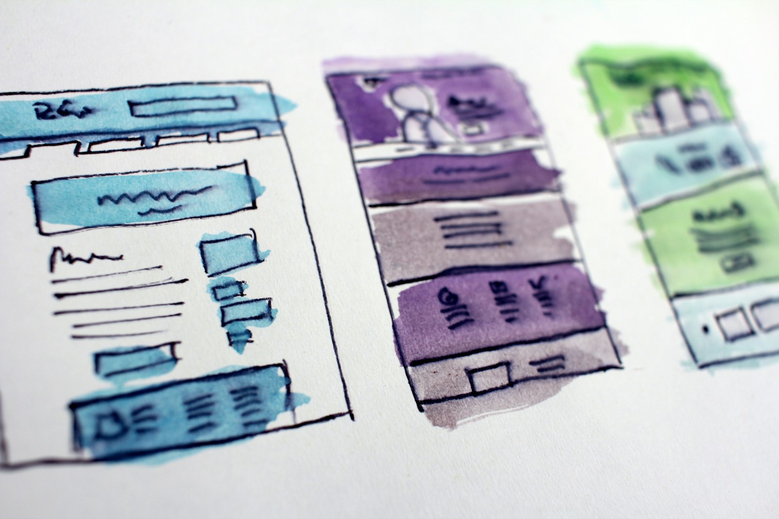
Agents in shared spaces
The picture so far has one human and one agent, but real work is collaborative, and agents are increasingly teammates in shared spaces — a repository, a project board, a group channel, a shared document. That setting adds constraints single-user design never faces.
Attribution comes first: everything an agent does in a shared space must be legible as agent work, at a glance, forever. A commit, comment, or edit that could be mistaken for a human’s is a small deception installed in the team’s record. Second, authority must be traceable: an agent acting in a shared space acts on someone’s behalf, and teammates need to see whose instruction, or whose standing rule, produced the action. Third, the interruption discipline from the notification problem compounds — an agent that pings a whole channel for approvals it should route to one person becomes a team-wide tax. And finally, shared spaces need shared controls: any teammate should be able to see what the agent is doing and, with appropriate permission, pause it, because a runaway agent in a shared repository is everyone’s problem.
Teaching the ceiling: discoverability
An empty text box is the most honest and least helpful interface ever shipped: it promises everything and explains nothing. Agent products suffer a peculiar discoverability problem — users chronically underestimate what agents can do, because nothing on screen suggests the ceiling, and then occasionally overestimate it in exactly the wrong place, because nothing on screen suggests the floor either.
The fixes are unglamorous and effective. Suggestions grounded in the user’s actual context — this spreadsheet, this inbox, this codebase — teach capability at the moment it is relevant, which is worth a hundred generic example prompts. Visible affordances for the agent’s tools, the way a toolbar communicates an editor’s powers, give shape to the possibility space. And the agent itself can carry the teaching load: when a request lands near something it does well, saying so — I can also reconcile these against the ledger if you want — turns every interaction into a small tour of the ceiling. The measure of success is the shrinking gap between what users ask for and what the system could have done for them.
Latency, honesty, and the shape of waiting
Agent latency is not a single number; it is a shape. There is the beat before the agent acknowledges the task, the stretch while it works, and the moment the result lands. Each phase has its own psychology and its own design answer. Acknowledgment must be near-instant even when the work is not — a restatement of the brief and a first step visible within seconds tells the user the delegation landed. The long middle is carried by the progress surface described earlier. The end deserves a clean, unambiguous arrival: a deliverable, a summary, a next action.
Two honesty rules govern the middle. First, never fake progress: a bar that crawls to ninety percent and stalls, or a rotating list of vague verbs disconnected from real activity, is discovered quickly and discounts every future signal. Second, set expectations with ranges the system can defend — this usually takes a few minutes — and update them when reality diverges. Users tolerate long waits remarkably well when the wait is legible; what they punish is silence, and what they remember is being lied to by an animation.
There is also a scheduling dimension: not all agent work needs to be watched. A well-designed product lets the user convert a long wait into background work with one gesture — go finish this, notify me when it needs me — which quietly moves the product up the autonomy spectrum at the user’s own initiative. The interface that makes walking away safe is the interface that has internalized every other principle in this post.
Correction is a gift: closing the loop
Every time a user edits an agent’s output, rejects a plan step, or rewrites a draft before sending, they are producing the most valuable signal the product will ever receive: a precise, in-context demonstration of the gap between what the agent did and what the user wanted. Most products let that signal evaporate.
Closing the loop starts with making correction effortless where the work lives — editing the artifact directly rather than describing desired changes in a side conversation — and continues with the product actually learning from it. Preferences inferred from repeated corrections should surface transparently: I notice you shorten my openings; want me to default to that? The transparency matters as much as the learning. Silent adaptation feels spooky and produces an agent whose behavior drifts inexplicably; visible, confirmable adaptation gives the user a hand on the dial and turns weeks of nudging into a one-tap standing instruction. Over time, the accumulation of confirmed preferences becomes something like a working relationship — the thing people actually mean when they say an assistant “gets” them.
Every correction a user makes is a gift of training signal. The interface’s job is to catch it, learn from it, and show its work while doing so.
Anti-patterns: a field guide
Most agent UX failures in the wild are variations on a short list. The black box runs silently and returns a result with no inspectable path, making both trust and debugging impossible. The chatterbox narrates every internal step in the transcript, training users to skim and miss the one message that mattered. The nag interrupts for everything, converting its approval mechanism into a reflex-yes machine. The cowboy acts first and mentions later, spending trust it has not earned. The amnesiac forgets every correction by the next session, ensuring the user’s investment in teaching it never compounds. And the impostor lets agent output masquerade as human work in shared spaces. Each has the same root: an interface that optimizes the demo experience over the working relationship.
The new vocabulary of interface primitives
Step back from the individual patterns and a vocabulary starts to emerge — a set of interface primitives that agentic products keep reinventing because the old widget set does not contain them. It is worth naming them, because naming is how a design discipline stops solving the same problem from scratch:
The brief: a structured statement of the task, its constraints, and its success criteria — the delegation contract that replaces the bare prompt.
The plan: the agent’s editable, approvable statement of intent before consequential work begins.
The activity surface: the live, intent-level account of what the agent is doing, with detail on demand.
The approval: a consequence-scaled request for judgment, carrying everything needed to judge it.
The interjection: a safe, well-defined channel for steering a running task without restarting it.
The checkpoint: a visible, restorable point in the work that makes undo a promise rather than a hope.
The deliverable: the work product as artifact, separated from narrative, reviewable in its native form.
The debrief: the cover note that aims the reviewer’s attention at what needs human judgment.
The registry: the single place where every standing agent, schedule, and permission is enumerated and controllable.
None of these primitives is exotic, and that is the point. Just as the last era of interfaces settled on scroll views, tabs, and pull-to-refresh, the agentic era is settling on briefs, plans, approvals, and debriefs. Teams that treat them as first-class components — designed once, reused everywhere — ship coherent products; teams that improvise them per feature ship a different agent experience on every screen.
Measuring whether any of this works
Agent UX has its own metrics, and they are not the engagement numbers of the feed era. The ones that matter are relational. Delegation rate: what share of eligible work do users actually hand to the agent, and does it grow? Intervention rate: how often do users interrupt or correct mid-run, and is it falling for task categories that should be maturing? Review depth: are users reading results or rubber-stamping them — and is the rubber-stamping happening where reliability actually justifies it? Approval fatigue is directly measurable as time-to-yes trending toward zero. Abandonment after failure tells you whether your failure states preserve or destroy the relationship. And the north star is retention of delegation: users who, month over month, hand the agent bigger and more consequential work are users whose trust the interface has earned and calibrated correctly.
Notice that a product can score brilliantly on session engagement while failing every one of these. A user who spends an hour a day supervising an agent they do not trust is a metric success and a product failure. The entire premise of agentic software is that the user’s time is the thing being purchased back; measuring anything that rewards consuming more of it is measuring the wrong thing.
The bottom line
Agentic AI changes the basic question an interface must answer. For forty years the question was: how do I make it easy for a person to operate this machine? The question now is: how do I make it safe, legible, and comfortable for a person to delegate to this machine — and how do I help them learn, accurately, how much delegation it deserves? Everything in this post is a variation on that theme. Show the work, so trust has evidence. Surface intent before action, so correction is cheap. Spend attention like money, so the asks that matter get answered with real judgment. Make reversibility visible, so autonomy is not a leap of faith. Hand over deliverables, not walls of text. Design the failures, because they are coming. And close the loop on correction, so the relationship compounds instead of resetting.
The models will keep improving, and each improvement will raise the ceiling on what can be delegated. But the ceiling users actually reach is set by the interface — by whether the product earns, calibrates, and rewards their trust. The teams that understand this are not building chatbots with better engines. They are building the working relationship between people and software that acts, and that relationship, not the model underneath it, is the product.
A case study in miniature: what coding agents got right
If you want to see agent UX evolving under real selective pressure, watch the coding tools, because software engineers are the most demanding early adopters an interface has ever had: they delegate consequential work, they verify everything, and they abandon tools loudly. The patterns that survived that gauntlet map almost one-to-one onto the vocabulary above. The diff became the universal deliverable — no serious coding agent describes its changes in prose when it can show them as a reviewable patch. The plan became standard for large tasks, with agents proposing an approach and waiting for a nod before touching twenty files. Checkpoints and instant rollback made it emotionally cheap to let the agent attempt something ambitious. Activity surfaces settled at the level of intent — running the tests, refactoring the parser — with raw logs one click away. And permission tiers emerged organically: read freely, edit with review, execute with approval, deploy only with explicit human action.
None of these patterns is specific to code. The diff generalizes to any before-and-after on a document, a spreadsheet, a calendar, a configuration. The test suite generalizes to any verifiable success criterion attached to a brief. The pull request — a bundle of changes, rationale, and evidence, submitted for review — may turn out to be the most influential interface pattern of the era, quietly becoming how all agent work gets handed over: here is what I did, here is why, here is the proof it works, approve or request changes. Coding got there first because its verification culture was already strong; the rest of knowledge work is following the same path a few years behind.
Beyond the screen: voice, ambient, and the disappearing interface
Everything above assumes a screen, but a growing share of agent interaction will not have one. Voice is the natural channel for delegation on the move, and it stresses every principle in this post at once: there is no persistent surface for plans, no glanceable progress, no diff to review. The design answer is not to cram the visual patterns into audio but to renegotiate the contract — voice briefs that end with a spoken read-back of the plan, work that defers its consequential steps until the user is back at a screen, and confirmations that arrive through whatever surface the user touches next. The principle survives translation even when the widgets do not: intent visible before action, consequence scaled to ceremony, results delivered in reviewable form.
Further out sits the genuinely ambient agent — software that watches a stream of work and acts on standing instructions without being summoned. Here the interface almost disappears, and what remains becomes correspondingly more important: the registry that enumerates what is running, the digest that reports what happened, the audit trail that answers how and why, and the single reliable gesture that pauses everything. The less often the user sees the agent, the more the few remaining touchpoints must carry, and the more a lapse in any of them corrodes. An ambient agent with a weak audit trail is not a product; it is a liability with a subscription fee.
Getting started: an incremental path
Teams rarely get to design an agent product from a blank page; most are retrofitting agency onto an existing application, and the good news is that the patterns compose incrementally. A pragmatic sequence looks like this. Start with the activity surface, because showing the work requires no new permissions and immediately improves trust in whatever autonomy already exists. Add plans for the largest tasks next, because previewing intent is the cheapest way to prevent the most expensive mistakes. Then rationalize approvals — audit every prompt you show, kill the ones that do not transfer a real decision, batch the rest, and add the do-not-ask-again escape hatch. Introduce checkpoints and undo as soon as the backend allows, and advertise them in the interface, because a safety net no one knows about calibrates no one’s behavior. Then build the registry, before your users’ standing tasks multiply beyond their memory of having created them. And instrument the relational metrics from day one, because delegation rate and intervention rate are the compass for everything after.
What should be resisted is the opposite sequence — shipping maximum autonomy first and retrofitting legibility after the first public failure. Trust lost to a silent, irreversible mistake is nearly unrecoverable, and products get very few such mistakes before users quietly retreat to doing the work themselves. The interface patterns in this post are not polish to be added when the roadmap allows. They are the load-bearing structure of the only thing an agentic product actually sells: the user’s willingness to let go.